responsesR: simulate Likert item responses in R 
This package aims to provide an easy way to:
- Simulate Likert-scale data in R, enabling users to define distributions, means, standard deviations, and correlations among latent variables.
- Generate Likert-type responses for single or multiple items.
- Simulate Likert scales with associations between items to measure underlying constructs.
- Create artificial data to validate theoretical findings, when employing statistical techniques such as Factor Analysis and Structural Equation Modeling.
- Estimate means and standard deviations of latent variables and recreate existing rating-scale data.
Installation
You can install the latest version using devtools:
# install.packages("devtools")
library(devtools)
install_github("markolalovic/responsesR")
Examples
Below you’ll find two simple examples that illustrate how to create synthetic datasets with responsesR. For further information, refer to the articles on the package website.
Simulating survey data
The following sample code creates a simulated survey data. The hypothetical survey simulation is roughly based on the actual comparative study on teaching and learning R in a pair of introductory statistics labs.
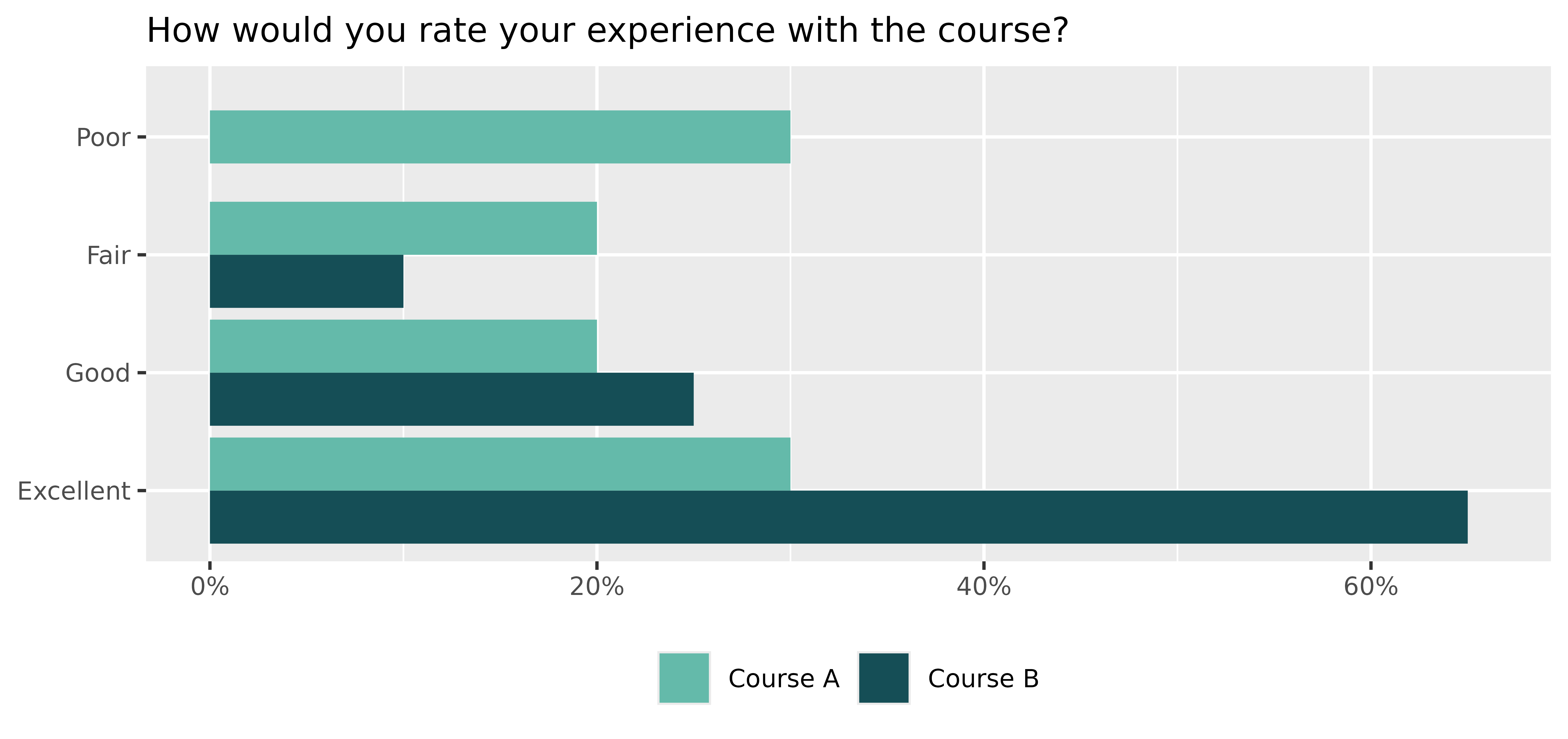
Consider a scenario where 10 participants who completed Course A and 20 participants who completed Course B have taken the survey. Let’s assume the initial question was:
“How would you rate your experience with the course?”
with four possible answers:
Poor, Fair, Good, and Excellent.
Let’s suppose that participants in Course A had a neutral opinion regarding the question, while those in Course B, on average, had a more positive experience.
By choosing appropriate parameters for the latent distributions and setting number of categories K = 4, we can generate hypothetical responses (standard deviation sd = 1 and skewness gamma1 = 0, by default):
set.seed(12345) # to ensure reproducible results
course_A <- get_responses(n = 10, mu = 0, K = 4)
course_B <- get_responses(n = 20, mu = 1, K = 4)Click here to expand
# To summarize the results, create a data frame from all responses.
K <- 4
ngroups <- 2
cats <- c("Poor", "Fair", "Good", "Excellent")
data <- data.frame(
  Course = rep(c("A", "B"), each=K),
  Response = factor(rep(cats, ngroups), levels=cats),
  Prop = c(get_prop_table(course_A, K), get_prop_table(course_B, K)))
data <- data[data$Prop > 0, ]
# > data
#   Course  Response Prop
# 1      A      Poor 0.30
# 2      A      Fair 0.20
# 3      A      Good 0.20
# 4      A Excellent 0.30
# 6      B      Fair 0.10
# 7      B      Good 0.25
# 8      B Excellent 0.65

# The results can then be visualized using a grouped bar chart.
xbreaks <- seq(from = 0, to = .8, length.out = 5)
xlimits <- c(0, max(data$Prop) + 0.01)
xlabs <- sapply(xbreaks, percentify)
data$Course <- factor(data$Course, levels = c("B", "A"))
p <- ggplot(data=data, aes(x=Prop, y=Response, fill=Course)) +
  geom_col(position=position_dodge2(preserve = "single", padding = 0)) +
  scale_x_continuous(breaks = xbreaks, labels = xlabs, limits = xlimits) +
  scale_y_discrete(limits = rev(levels(data$Response))) +
  scale_fill_manual("legend",
                    values = c("#64BAAA", "#154E56"),
                    labels = c("Course A", "Course B"),
                    limits = c("A", "B")) +
  ggtitle("How would you rate your experience with the course?") +
  theme(text = element_text(size=10),
        axis.title.y = element_blank(),
        axis.title.x = element_blank(),
        legend.position = "bottom",
        legend.title = element_blank(),
        plot.title = element_text(size=11))
p
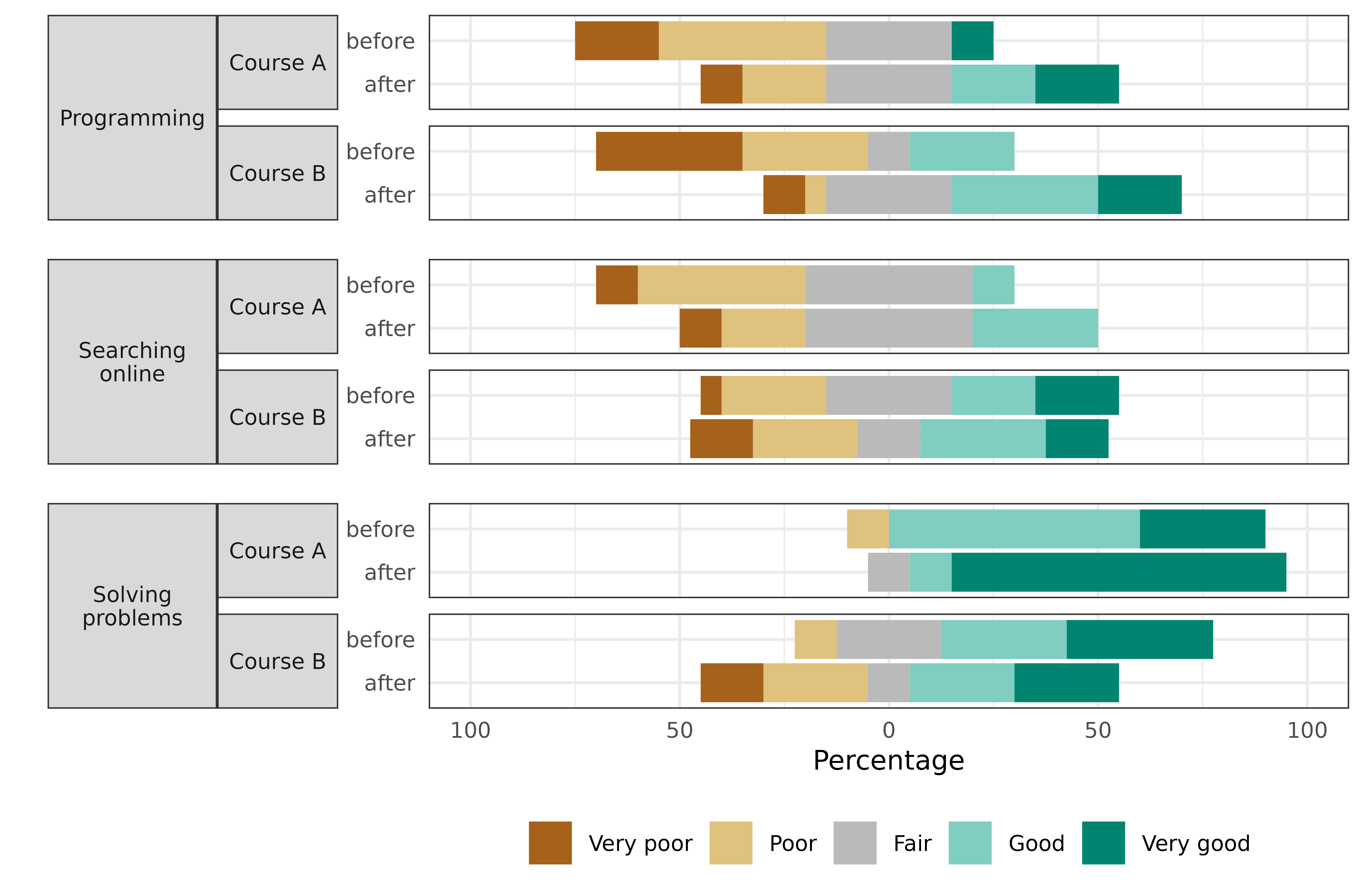
Suppose that the survey also asked the participants to rate their skills on a 5-point Likert scale, ranging from 1 (very poor) to 5 (very good) in:
- Programming,
- Searching Online,
- Solving Problems.
The survey was completed by the participants both before and after taking the course for a pre and post-comparison. Suppose that participants’ assessments of:
- Programming skills on average increased,
- Searching Online stayed about the same,
- Solving Problems increased in Course A, but decreased for participants in Course B.
Let’s simulate the survey data for this scenario (number of categories is K = 5 by default):
set.seed(12345) # to ensure reproducible results

# Pre- and post assessments of skills: 1, 2, 3 for course A
pre_A <- get_responses(n = 10, mu = c(-1, 0, 1))
post_A <- get_responses(n = 10, mu = c(0, 0, 2))

# Pre- and post assessments of skills: 1, 2, 3 for course B
pre_B <- get_responses(n = 20, mu = c(-1, 0, 1))
post_B <- get_responses(n = 20, mu = c(0, 0, 0)) # <-- decrease for skill 3Click here to expand
# To summarize the results, create a data frame from all responses.
data <- list(pre_A, post_A, pre_B, post_B)
items <- 6 # for 3 questions before and after
K <- 5 # for a 5-point Likert scale
skills <- c("Programming", "Searching online", "Solving problems")
questions <- rep(as.vector(sapply(skills, function(skill) rep(skill, K))), 4)
questions <- factor(questions, levels = skills)
data <- data.frame (
  Course = c(rep("Course A", items * K), rep("Course B", items * K)),
  Question = questions,
  Time = as.factor(rep(c(rep("before", 3*K), rep("after", 3*K)), 2)),
  resp = rep(rep(1:K, 3), length(data)),
  prop = as.vector(sapply(data, function(d) as.vector(t(get_prop_table(d, K))))))
# > head(data)
#     Course         Question   Time resp prop
# 1 Course A      Programming before    1  0.2
# 2 Course A      Programming before    2  0.4
# 3 Course A      Programming before    3  0.3
# 4 Course A      Programming before    4  0.0
# 5 Course A      Programming before    5  0.1
# 6 Course A Searching online before    1  0.1

# And visualize the results with a stacked bar chart:
data_pos <- data[data$resp >= 4, ]
data_neg <- data[data$resp <= 2, ]

data_neu <- data[data$resp == 3, ]
data_neu$prop <- data_neu$prop / 2

data_pos <- rbind(data_pos, data_neu)
data_pos$resp <- factor(data_pos$resp, levels = rev(1:5))

data_neg <- rbind(data_neg, data_neu)
data_neg$prop <- (-data_neg$prop)
data_neg$resp <- factor(data_neg$resp, levels = 1:5)

color_palette <- brewer.pal(n=5, name = "BrBG")
color_palette[3] <- "#bababaff"
p <- ggplot(data = data_pos, aes(x = Time, y = prop, fill = resp)) +
  geom_col() +
  geom_col(data = data_neg) +
  coord_flip() +
  facet_nested(
    rows = vars(Question, Course), switch = "y",
    strip = strip_nested(size = "variable"),
    labeller = labeller(Question = label_wrap_gen(width = 10))
  ) +
  theme_bw() +
  theme(strip.placement = "outside") +
  theme(
    axis.ticks.x = element_blank(),
    axis.ticks.y = element_blank(),
    legend.position = "bottom",
    legend.title = element_blank(),
    text = element_text(size = 10),
    strip.text.y.left = element_text(angle = 0, size = 8),
    panel.spacing.y = unit(c(2, 5, 2, 5, 2), "mm")
  ) +
  xlab("") +
  ylab("Percentage") +
  scale_y_continuous(limits = c(-1, 1),
                     breaks = seq(from = -1, to = 1, by = 0.5),
                     labels = c(100, 50, 0, 50, 100)) +
  scale_fill_manual("", breaks = 1:5, values = color_palette,
                      labels = c("Very poor", "Poor", "Fair", "Good", "Very good"))
p
Replicating survey data
The following sample code covers the topic of replicating survey data in order to create scale scores. For this, we will use part of bfi dataset from package psych. In particular, only the first 5 items A1-A5 corresponding to agreeableness and attribute gender:
Each item was answered on a six point scale ranging from 1 (very inaccurate), to 6 (very accurate) and the size of the female and male samples were 1881 and 919 respectively:Click here to expand
# Males = 1, Females = 2.
mapdf <- data.frame(old = 1:2, new = c("Male", "Female"))
data$gender <- mapdf$new[match(data$gender, mapdf$old)]

# Impute the missing values.
for (avar in avars) {
  data[, avar][is.na(data[, avar])] <- median(data[, avar], na.rm=TRUE)
}
knitr::kable(head(data), format="html")
table(data$gender)
| A1 | A2 | A3 | A4 | A5 | gender | |
|---|---|---|---|---|---|---|
| 61617 | 2 | 4 | 3 | 4 | 4 | Male |
| 61618 | 2 | 4 | 5 | 2 | 5 | Female |
| 61620 | 5 | 4 | 5 | 4 | 4 | Female |
| 61621 | 4 | 4 | 6 | 5 | 5 | Female |
| 61622 | 2 | 3 | 3 | 4 | 5 | Male |
| 61623 | 6 | 6 | 5 | 6 | 5 | Female |
#>
#> Female   Male
#>   1881    919
Separate the items into two groups according to their gender.
items_M <- data[data$gender == "Male", avars]
items_F <- data[data$gender == "Female", avars]
To reproduce the items, start by estimating the parameters of the latent variables, assuming they are normal (gamma1 = 0 by default) and providing the number of possible response categories K = 6:
params_M <- estimate_parameters(data = items_M, K = 6)
params_F <- estimate_parameters(data = items_F, K = 6)
params_M
#>          items
#> estimates         A1         A2         A3         A4         A5
#>        mu -0.6618876  0.8649575  0.7645033  0.8412600  0.7734527
#>        sd  1.0967866  0.7925097  0.8540241  1.1957912  0.8910793
params_F
#>          items
#> estimates         A1         A2         A3         A4         A5
#>        mu -1.1272393  1.1838317  1.0758738  1.3342088  0.9543986
#>        sd  1.1582560  0.7762984  0.8187612  1.4088157  0.8493250
Then, generate new responses to the items using the estimated parameters and correlations:
set.seed(12345) # to ensure reproducible results

new_items_M <- get_responses(n = nrow(items_M),
                             mu = params_M["mu", ],
                             sd = params_M["sd", ],
                             K = 6,
                             R = cor(items_M))

new_items_F <- get_responses(n = nrow(items_F),
                             mu = params_F["mu", ],
                             sd = params_F["sd", ],
                             K = 6,
                             R = cor(items_F))
To compare the results, we can plot the correlation matrix with bar charts on the diagonal: 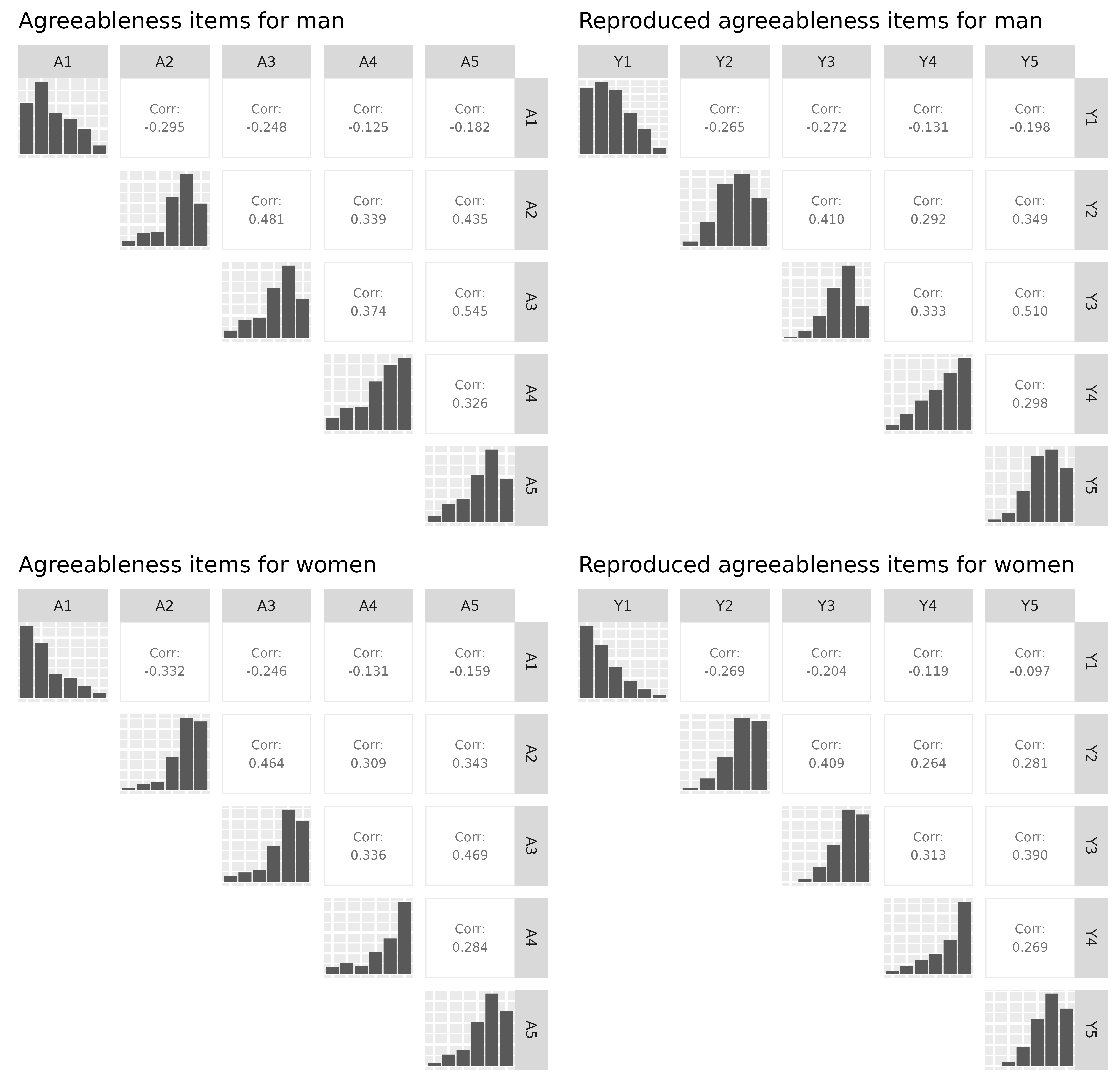
Click here to expand
# Combine new items and gender in new_data data frame.
new_data <- data.frame(rbind(new_items_M, new_items_F))
new_data$gender <- c(rep("Male", nrow(items_M)), rep("Female", nrow(items_F)))
head(new_data)
# We also need to reverse the first item because it has negative correlations
data$A1 <- (min(data$A1) + max(data$A1)) - data$A1
new_data$Y1 <- (min(new_data$Y1) + max(new_data$Y1)) - new_data$Y1
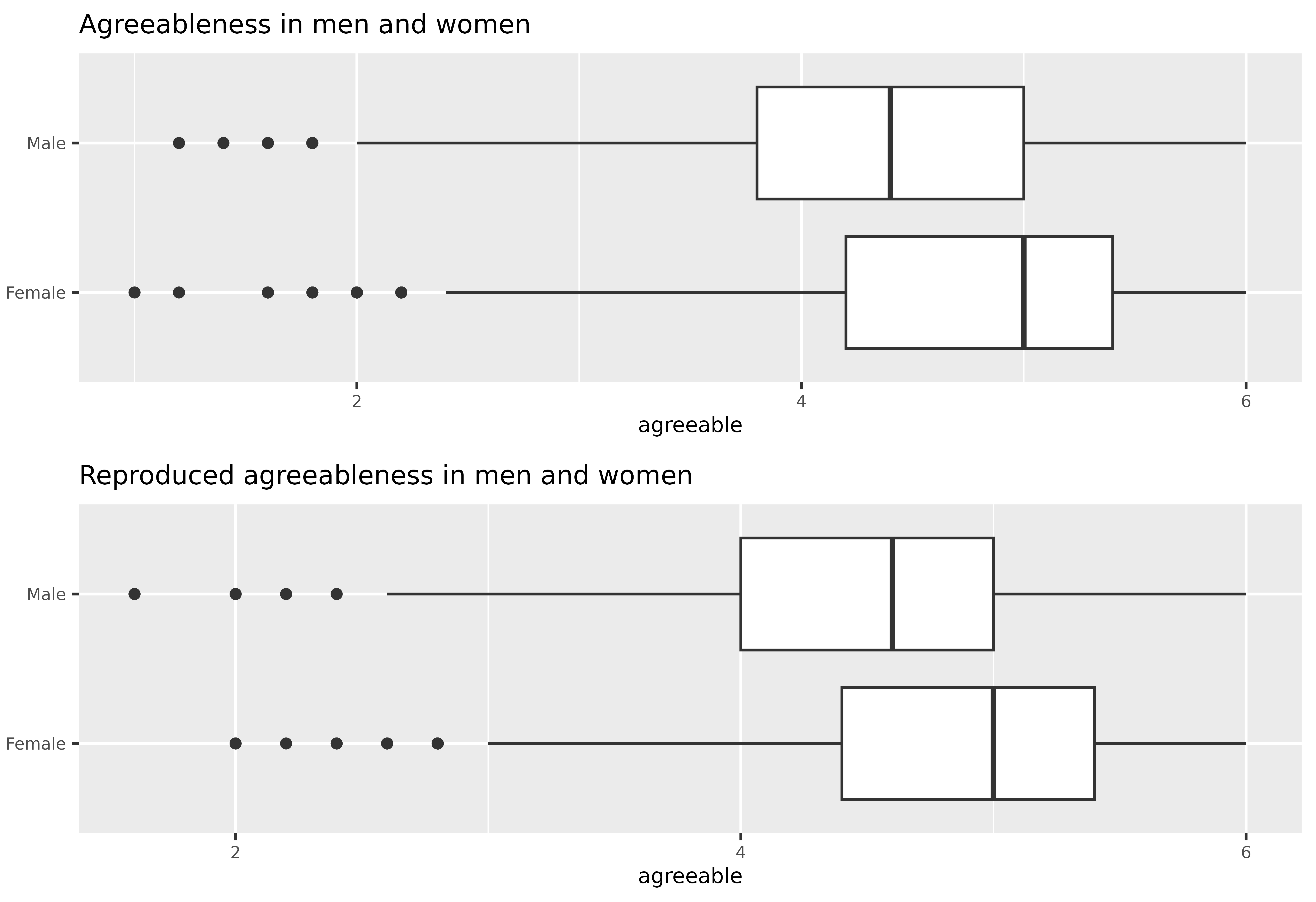
# Create agreeableness scale scores
data$agreeable <- rowMeans(data[, avars])
new_data$agreeable <- rowMeans(new_data[, c("Y1", "Y2", "Y3", "Y4", "Y5")])
# And visualize the results with a grouped boxplot.
scale_boxplot <- function(data, title="") {
xbreaks <- seq(from = 2, to = 6, length.out = 3)
p <- ggplot(data, aes(x = agreeable, y = gender)) +
geom_boxplot() +
scale_x_continuous(breaks = xbreaks) +
ggtitle(title) +
theme(text = element_text(size = 8),
plot.title = element_text(size=10),
axis.title.y = element_blank())
return(p)
}
p1 <- scale_boxplot(data, "Agreeableness in men and women")
p2 <- scale_boxplot(new_data, "Reproduced agreeableness in men and women")
plot_grid(p1, p2, nrow = 2)
Dependency statement
To maintain a lightweight package, responsesR only imports mvtnorm, along with the standard R packages stats and graphics, which are typically included in R releases. An additional suggested dependency is the package sn, necessary only for generating random responses from correlated Likert items with multivariate skew normal latent distribution. However, the package prompts the user to install this dependency during interactive sessions.
Simulation design
Simulating Likert item responses begins by selecting a continuous distribution, which is then transformed into a discrete probability distribution using a method called discretization. This process is illustrated in Figure 2.
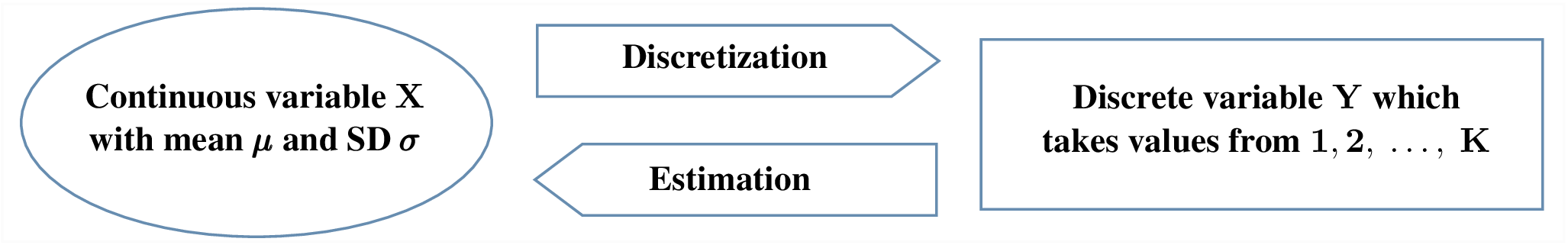
Figure 2: Flow diagram of the simulation process.
The transformation is visually depicted in Figures 3 and 4. These figures show the densities of normally distributed X1 and X2 in Figure 3A and skew normally distributed X1 and X2 with skewness gamma1 = -0.6 in Figure 4A. Corresponding discrete probability distributions of Y1 and Y2 with K = 5 categories are presented in Figures 3B and 4B.
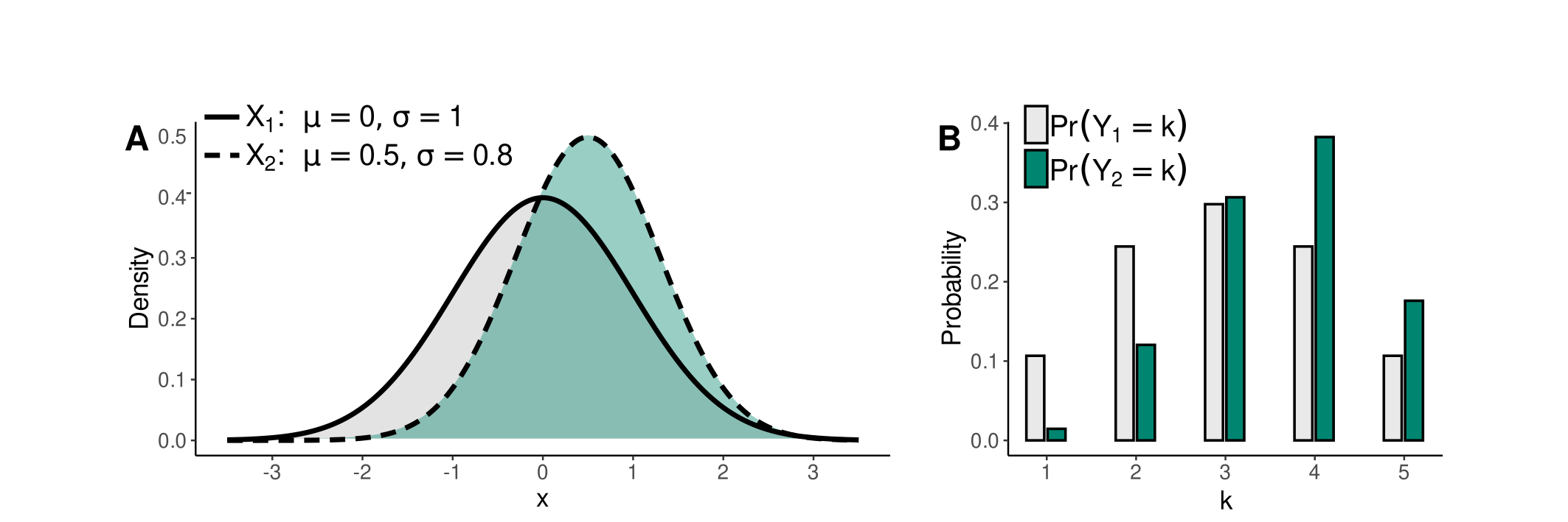
Figure 3: Relationship between normally distributed X and responses Y.
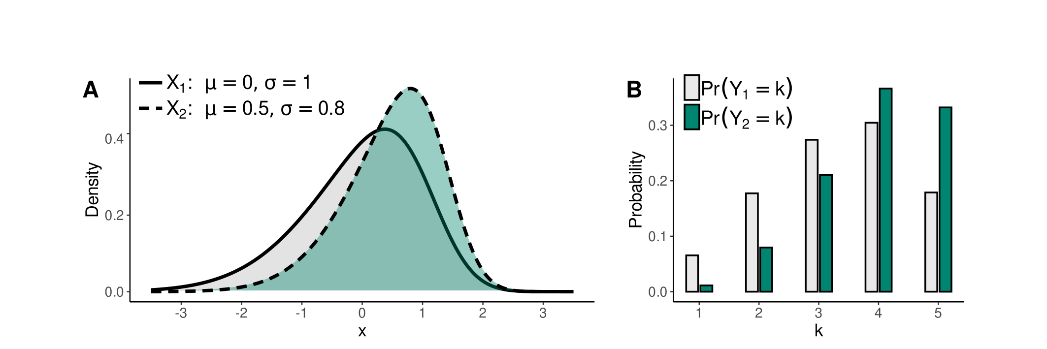
Figure 4: Relationship between skew normal X with gamma1 = -0.6, and responses Y.