Simulating survey data
Marko Lalovic
Last Updated: 2024-03-28
Source:vignettes/articles/simulating_survey_data.Rmd
simulating_survey_data.Rmd
# load responsesR
library(responsesR)

# optionally, to recreate the plots:
library(RColorBrewer)
library(ggh4x)
#> Loading required package: ggplot2
#>
#> Attaching package: 'ggh4x'
#> The following object is masked from 'package:ggplot2':
#>
#>     guide_axis_logticks
This article covers the topic of simulating hypothetical survey data. The hypothetical survey simulation is roughly based on the actual comparative study on teaching and learning R in a pair of introductory statistics labs (McNamara 2024).
Comparison of introductory statistics courses
Imagine a situation in which 10 participants from Course A and 20 participants from Course B have completed the survey. Suppose that the initial question was:
“How would you rate your experience with the course?”
with four possible answers:
Poor, Fair, Good, and Excellent.
Let’s assume that the participants in Course A were neutral regarding the question and participants in Course B had a more positive experience on average.
By choosing appropriate parameters for the latent distributions and
setting number of categories K = 4, we can generate
hypothetical responses (standard deviation sd = 1 and
skewness gamma1 = 0, by default):
set.seed(12345) # to ensure reproducible results
course_A <- get_responses(n = 10, mu = 0, K = 4)
course_B <- get_responses(n = 20, mu = 1, K = 4)
To summarize the results, create a data frame from all responses.
K <- 4
ngroups <- 2
cats <- c("Poor", "Fair", "Good", "Excellent")
data <- data.frame(
  Course = rep(c("A", "B"), each=K),
  Response = factor(rep(cats, ngroups), levels=cats),
  Prop = c(get_prop_table(course_A, K), get_prop_table(course_B, K)))
data <- data[data$Prop > 0, ]
knitr::kable(data, format="html", row.names = FALSE)| Course | Response | Prop |
|---|---|---|
| A | Poor | 0.30 |
| A | Fair | 0.20 |
| A | Good | 0.20 |
| A | Excellent | 0.30 |
| B | Fair | 0.10 |
| B | Good | 0.25 |
| B | Excellent | 0.65 |
The results can then be visualized using a grouped bar chart.
xbreaks <- seq(from = 0, to = .8, length.out = 5)
xlimits <- c(0, max(data$Prop) + 0.01)
xlabs <- sapply(xbreaks, percentify)
data$Course <- factor(data$Course, levels = c("B", "A"))
p <- ggplot(data=data, aes(x=Prop, y=Response, fill=Course)) +
  geom_col(position=position_dodge2(preserve = "single", padding = 0)) +
  scale_x_continuous(breaks = xbreaks, labels = xlabs, limits = xlimits) +
  scale_y_discrete(limits = rev(levels(data$Response))) +
  scale_fill_manual("legend",
                    values = c("#64BAAA", "#154E56"),
                    labels = c("Course A", "Course B"),
                    limits = c("A", "B")) +
  ggtitle("How would you rate your experience with the course?") +
  theme(text = element_text(size=10),
        axis.title.y = element_blank(),
        axis.title.x = element_blank(),
        legend.position = "bottom",
        legend.title = element_blank(),
        plot.title = element_text(size=11))
p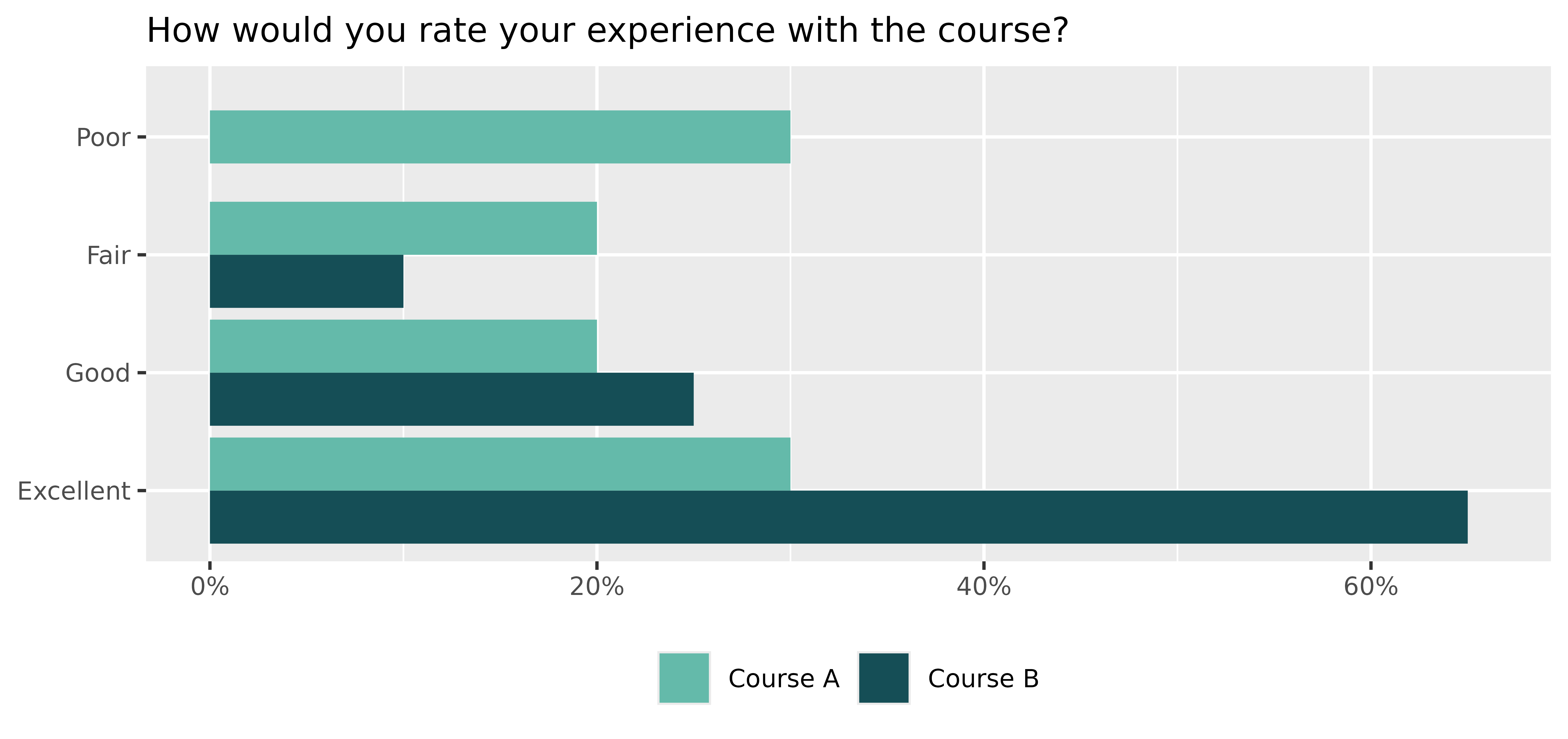
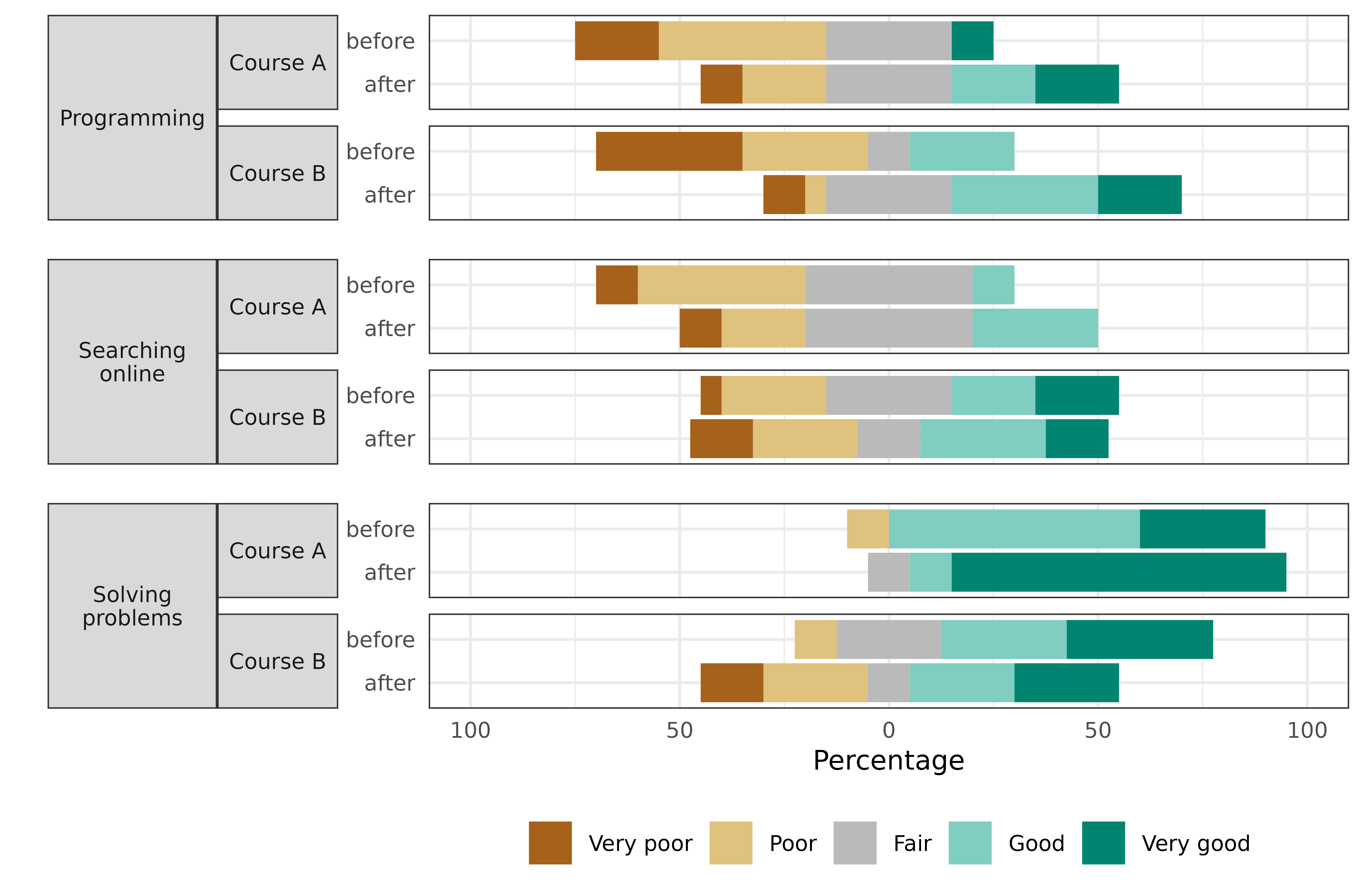
Pre- and post comparison
Now suppose that the survey also asked the participants to rate their skills on a 5-point Likert scale, ranging from 1 (very poor) to 5 (very good) in:
- Programming,
- Searching Online,
- Solving Problems.
The survey was completed by the participants both before and after taking the course for a pre and post-comparison. Suppose that participants’ assessments of:
- Programming skills on average increased,
- Searching Online stayed about the same,
- Solving Problems increased in Course A, but decreased for participants in Course B.
Let’s simulate the survey data for this scenario (number of
categories is K = 5 by default):
set.seed(12345) # to ensure reproducible results
# Pre- and post assessments of skills: 1, 2, 3 for course A
pre_A <- get_responses(n = 10, mu = c(-1, 0, 1))
post_A <- get_responses(n = 10, mu = c(0, 0, 2))

# Pre- and post assessments of skills: 1, 2, 3 for course B
pre_B <- get_responses(n = 20, mu = c(-1, 0, 1))
post_B <- get_responses(n = 20, mu = c(0, 0, 0)) # <-- decrease for skill 3
Create a data frame from all responses to summarize the results:
data <- list(pre_A, post_A, pre_B, post_B)
items <- 6 # for 3 questions before and after
K <- 5 # for a 5-point Likert scale
skills <- c("Programming", "Searching online", "Solving problems")
questions <- rep(as.vector(sapply(skills, function(skill) rep(skill, K))), 4)
questions <- factor(questions, levels = skills)
data <- data.frame (
  Course = c(rep("Course A", items * K), rep("Course B", items * K)),
  Question = questions,
  Time = as.factor(rep(c(rep("before", 3*K), rep("after", 3*K)), 2)),
  resp = rep(rep(1:K, 3), length(data)),
  prop = as.vector(sapply(data, function(d) as.vector(t(get_prop_table(d, K))))))
head(data)
#>     Course         Question   Time resp prop
#> 1 Course A      Programming before    1  0.2
#> 2 Course A      Programming before    2  0.4
#> 3 Course A      Programming before    3  0.3
#> 4 Course A      Programming before    4  0.0
#> 5 Course A      Programming before    5  0.1
#> 6 Course A Searching online before    1  0.1
And visualize the results with a stacked bar chart:
data_pos <- data[data$resp >= 4, ]
data_neg <- data[data$resp <= 2, ]

data_neu <- data[data$resp == 3, ]
data_neu$prop <- data_neu$prop / 2

data_pos <- rbind(data_pos, data_neu)
data_pos$resp <- factor(data_pos$resp, levels = rev(1:5))

data_neg <- rbind(data_neg, data_neu)
data_neg$prop <- (-data_neg$prop)
data_neg$resp <- factor(data_neg$resp, levels = 1:5)

color_palette <- brewer.pal(n=5, name = "BrBG")
color_palette[3] <- "#bababaff"
p <- ggplot(data = data_pos, aes(x = Time, y = prop, fill = resp)) +
  geom_col() +
  geom_col(data = data_neg) +
  coord_flip() +
  facet_nested(
    rows = vars(Question, Course), switch = "y",
    strip = strip_nested(size = "variable"),
    labeller = labeller(Question = label_wrap_gen(width = 10))
  ) +
  theme_bw() +
  theme(strip.placement = "outside") +
  theme(
    axis.ticks.x = element_blank(),
    axis.ticks.y = element_blank(),
    legend.position = "bottom",
    legend.title = element_blank(),
    text = element_text(size = 10),
    strip.text.y.left = element_text(angle = 0, size = 8),
    panel.spacing.y = unit(c(2, 5, 2, 5, 2), "mm")
  ) +
  xlab("") +
  ylab("Percentage") +
  scale_y_continuous(limits = c(-1, 1),
                     breaks = seq(from = -1, to = 1, by = 0.5),
                     labels = c(100, 50, 0, 50, 100)) +
  scale_fill_manual("", breaks = 1:5, values = color_palette,
                      labels = c("Very poor", "Poor", "Fair", "Good", "Very good"))
p